Tuesday, September 9, 2014

9 9 2014 Distribution Overlay Graphs in R for Size Data

DistributionOverlayGraphs.R
library(ggplot2)
#ggplot2 makes the distribution curve graphs
library(car)
#not sure what car does but I think it works with lattices
library(splitstackshape)
## Loading required package: data.table
#splitstackshape is an easy package that can help you split columns that have delimiters,
#Original CSV file column labelled "Tray" had entries that needed to be split
picsize5=read.csv('ImageJsize4.csv')
#creates dataframe and reads in the CSV file for sizes
picsize6<-concat.split.multiple(picsize5, "Tray", " ")
#splits the Tray column into Tray_1 with Site Number and Tray_2 with Tray number
foys<-subset(picsize6, Date=="2/26/2014"& Site=="Oyster Bay")
#creates a subset data frame for just the size data from February 26th at Oyster Bay
ggplot(foys, aes(x=Length.mm))+geom_density(aes(group=Tray_1, colour=Tray_1, fill=Tray_1),alpha=0.3)
plot of chunk unnamed-chunk-1
#creates distribution graph overlays for all populations in Feb at Oyster Bay. Looks cool.
fman<-subset(picsize6, Date=="2/26/2014"& Site=="Manchester")
ggplot(fman, aes(x=Length.mm))+geom_density(aes(group=Tray_1, colour=Tray_1, fill=Tray_1),alpha=0.3)
plot of chunk unnamed-chunk-1
ffid<-subset(picsize6, Date=="2/28/2014"&Site=="Fidalgo")
ggplot(ffid, aes(x=Length.mm))+geom_density(aes(group=Tray_1, colour=Tray_1, fill=Tray_1),alpha=0.3)
plot of chunk unnamed-chunk-1
#ffid and fman are just repeating the same subset dataframe command
#and then creating distribution overlay graphs for each site

Monday, September 8, 2014

9 8 2014 Kaplan Meier Survival Graphs

Seattle, WA

Mid 50s to Low 70s Mostly Cloudy

Worked through the examples in Statistical Computing as well as an R instruction video which uses the same sample problem as Statistical Computing as seen below.


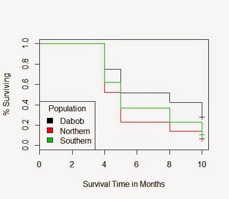
Using my own data from Dabob since the experiment has concluded there, I was able to create a Kaplan Meier graph of survival that compares all three populations at Dabob. This information is censured as there were some animals lost during the experiment. This censorship is marked with a cross at the end as I assumed that when the trays were picked up all animals would be accounted for unless they were definitely missing. The graph is below.


As you can see their seems to be a difference in Survival between the populations. I was not sure if this difference was significant. By modifying the example code from Statistical Computing, I was able to show the mean month of death for each population, the variance for each population, as well as test for significant difference by using survreg. This function helps elucidate any differences between samples that may have extreme variance from one another. In this data set, it showed that there is a significant difference in month of death between all populations. You can see the code for everything and the responses below.

>KMdata3=read.csv("KMdata3.csv")
>attach(KMdata3)
>names(KMdata3)
#[1] "Animal"     "Population" "Death"      "Status"  
>tapply(Death[Status==1],Population[Status==1],mean)
#H        N        S 
#6.034682 5.163311 5.744186 
>tapply(Death[Status==1],Population[Status==1],var)
#H        N        S 
#5.471257 3.280445 4.768906 
>model<-survreg(Surv(Death,Status)~Population,dist="exponential")
> summary(model)
#
#Call:
#  survreg(formula = Surv(Death, Status) ~ Population, dist = "exponential")
#Value Std. Error     z        p
#(Intercept)  2.293     0.0538 42.66 0.00e+00
#PopulationN -0.518     0.0716 -7.24 4.65e-13
#PopulationS -0.361     0.0722 -5.00 5.87e-07
#
#Scale fixed at 1 
#
#Exponential distribution
#Loglik(model)= -3641   Loglik(intercept only)= -3668.9
#Chisq= 55.8 on 2 degrees of freedom, p= 7.6e-13 
#Number of Newton-Raphson Iterations: 3 
#n= 1440 
> plot(fit3, col=c(1:3), xlab="Survival Time in Months", ylab="% Surviving")
> legend("bottomleft", title="Population", c('Dabob','Northern','Southern'), fill=c(1:3))

Tuesday, August 19, 2014

8 19 2014 ImageJ Analysis

FTR 230

Hi 60s to low 70s sunny

Participants: Sam Adams and Jake Heare

Sam showed me how to do the ImageJ measurements on the trays today as well as complete several of the trays. The procedure is quite simple.


  1. Open original image in ImageJ
  2. Select line tool
  3. Using on tray size standard (calipers or tile) draw a line
  4. Click M to save after each measurement
  5. repeat this 5 times on the size standard
  6. On each oyster start at the edge of the umbo and draw a line to the furthest point on the bill. 
  7. Click M to save each measure
  8. Proceed measure all oysters in a logical manner from left to right in each quadrant. 
  9. Once all have been measure click Save As in Results window
  10. Save file with the tray label followed by date followed by the word Raw.
  11. Open file in Excell
  12. To get the size conversion you must average of the first 5 "Area" measurements.
  13. Then divide the known size of the Size standard. (10 mm on calipers, 6 inches for tile) by the average you get from the firt 5 measurements.
  14. Using the conversion ratio you can then multiple each ImageJ "Area" measurement by the conversion ratio. 
  15. On the right side of the spreadsheet dedicate 5 columns to the measurements
  16. Column 1 (C1) = Date, C2 = Tray, C3 = Oyster Number, C4 = Area measure, C5 = converted area measurement
  17. Fill in columns with appropriate info
  18. Save file as Excel workbook in eagle/dermochelys/ImageJake with just the tray label and date info
  19. Copy and paste the 5 right side columns into the google sheets master document on Google docs
  20. Repeat process for each image. This should create two files for each image, a raw data and a converted data file. 

Monday, August 18, 2014

8 18 2014 larval counts

Taylor shellfish hatchery, quilcene, wa

Hi 60s to low 80s

Participants brent vadopalas and Jake heare

Went to taylor shellfish to use their z2 culture counter.  took brent and i a couple hours to trouble shoot a tentative protocol for using it. Will have to come back and continue counts for several more days as procedure takes longer than expected. Will provide protocol when it's formally generated in near future. Counts completed today were quite low as compared to numbers provided by dr. Friedman. Brent feels the numbers are accurate.